
Snezar
New graphic identity
How to rebrand a South African product for South Africans without using an African continent symbol?
SNEZAR is a South African bamboo watch brand from Cape Town created by Sinekhaya Manciya. Later joined by Tsepo Ngwenyama, together they wanted to enhance the branding identity which was resumed at the wording SNEZAR (SNE for the Sinekhaya's initials + ZAR for the South African currency's initials) with the addition of the African continent.
Own your time, Own your future!
Describing themselves as "Just two young South Africans who are passionate about building something of our own", Tsepo and Siné are targeting unprivileged and also middle-class people of South Africa. Young entrepreneurs who believe they don't need to pay a big price for looking nice and who want to own their time, to own their future.
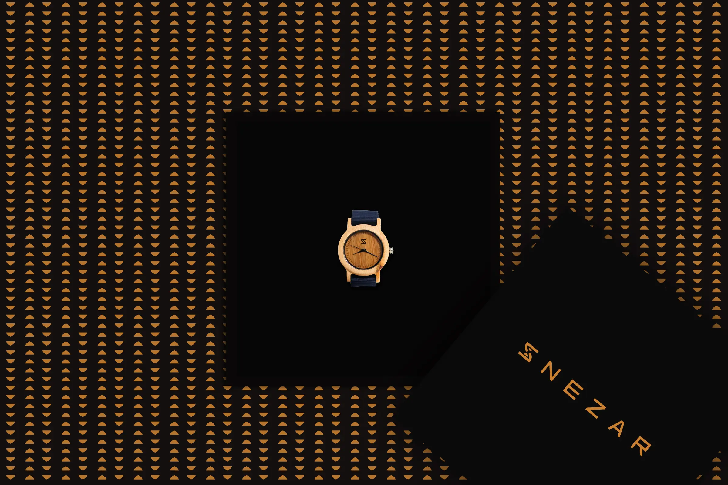
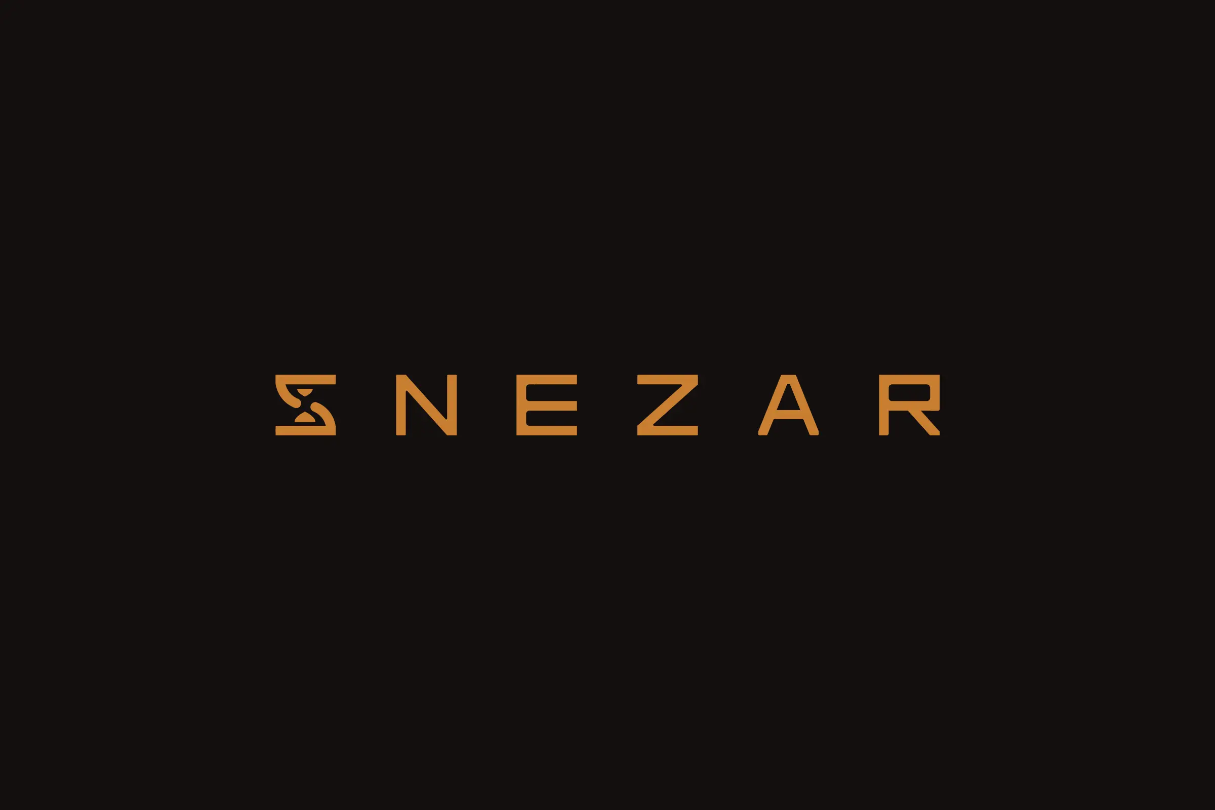
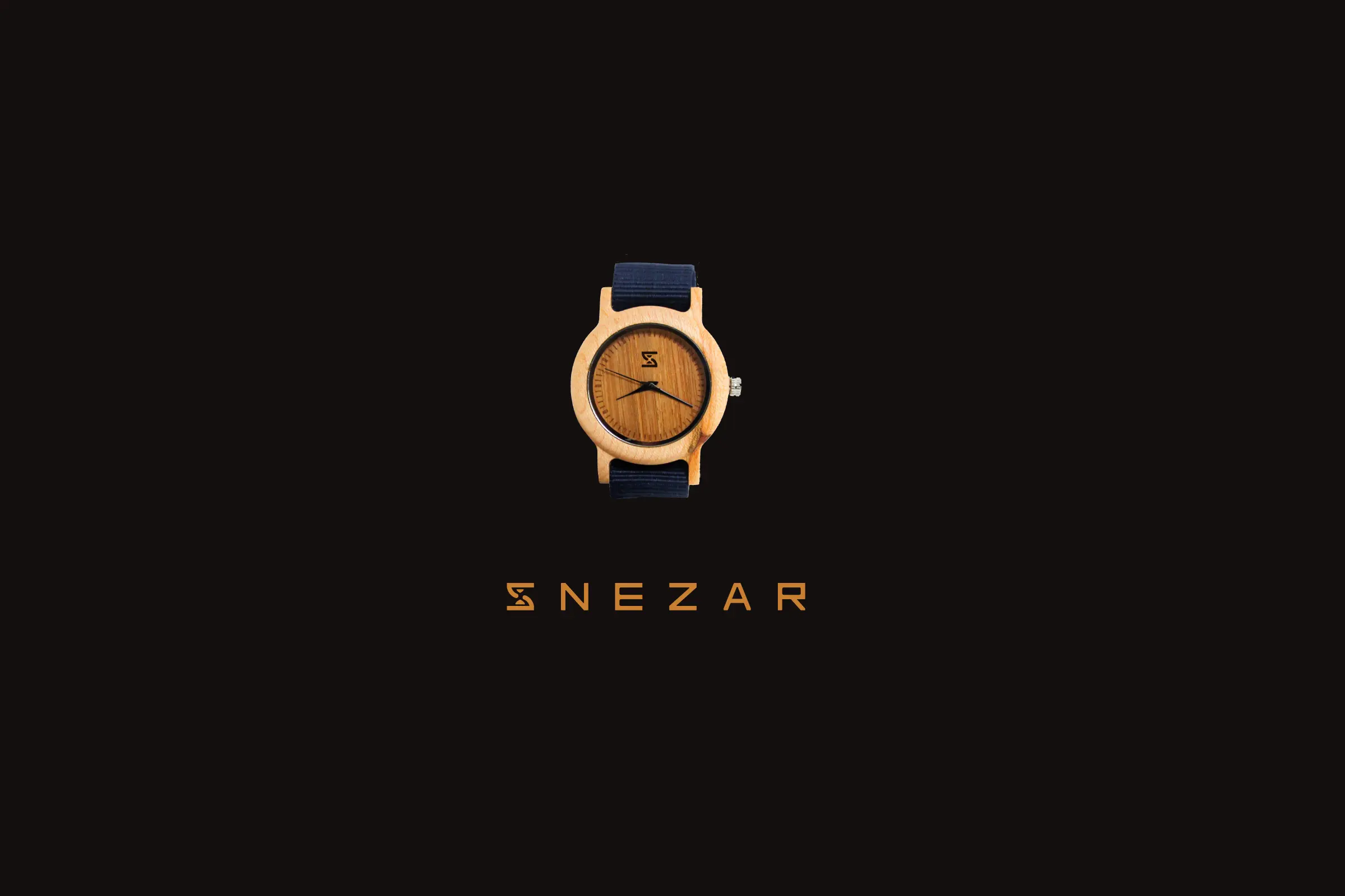
Symbol of time
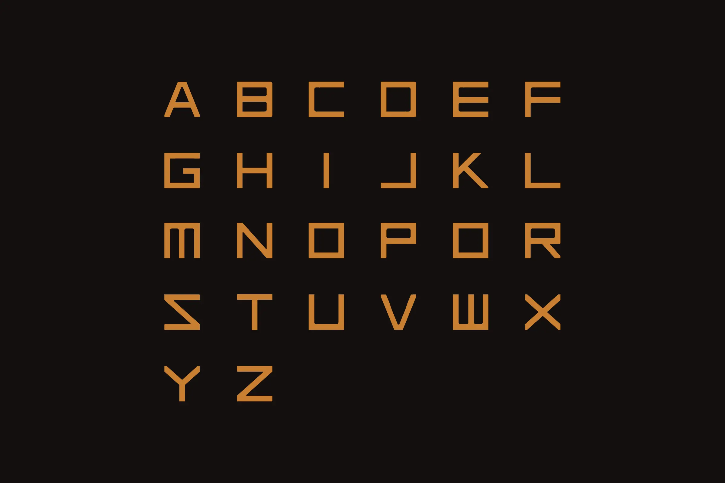
My graphic answer started from searching on this last tagline. I decided to create a logo-mark which uses the first letter of the brand where a hourglass, symbol of time, is coming to be sculpted inside this "S". The logo-mark is also contained inside a logo-type. For the colours, the clients insisted about a brand dedicated for a South African public so the sobriety of the black colour was chosen. I used a yellow-gold colour to contrast which brings a smart touch but it still stays affordable. About the typography, I decided to create a specific one instead of using a trendy one, in order to enhance the originality of the graphic identity.
Year
September 2017
Lire en Français 🇫🇷