
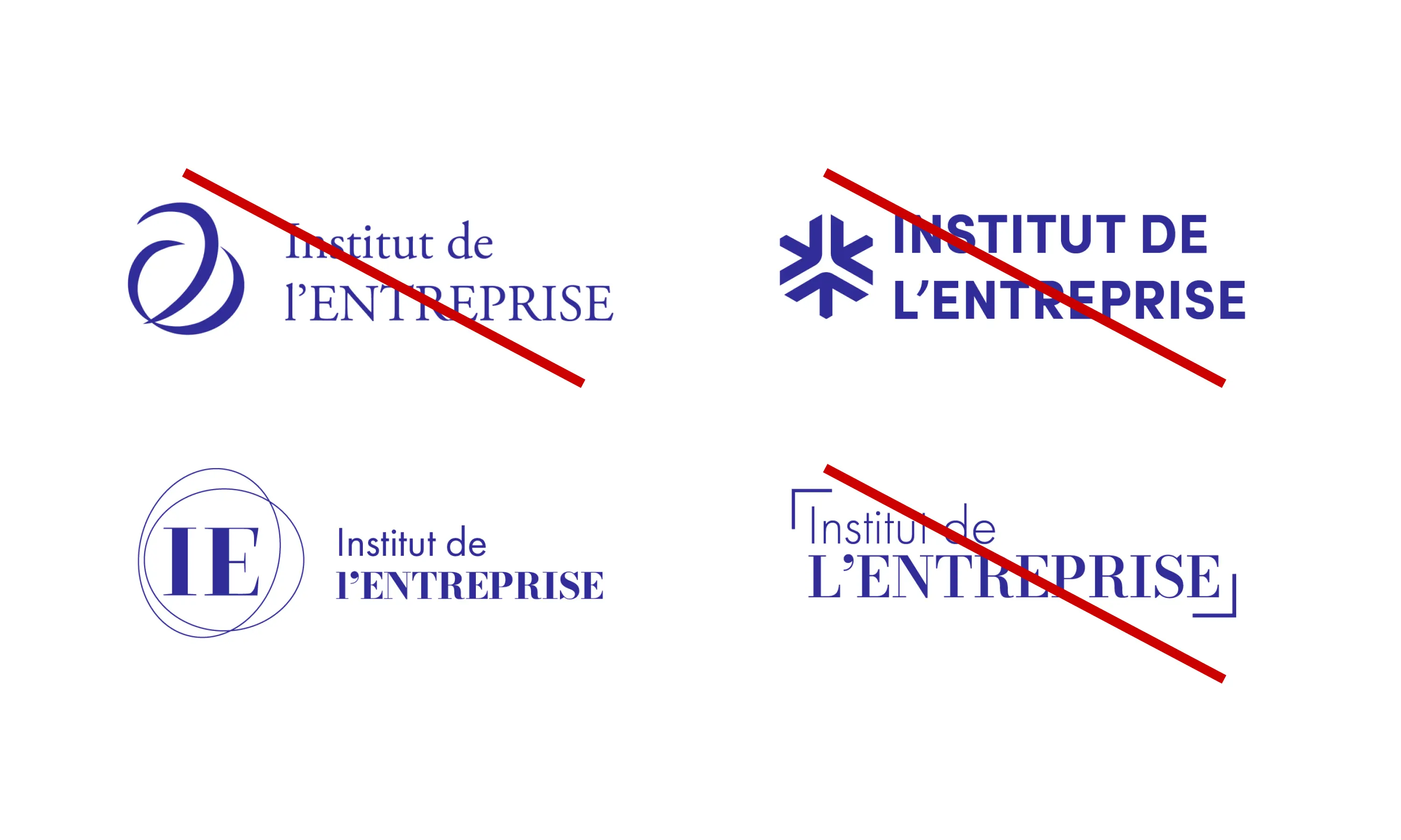
L'Institut de l'Entreprise
Branding
Bringing the French closer to Businesses.
Created in 1975, l'Institut de l'Entreprise is a non-for-profit bringing together around a hundred companies that are multinational in scale but have a strong presence in France. The Institut works to promote the role and place of business in our society through a variety of programs:
- L'Agora orchestrates collegial work between managers and stakeholders on the major transformations and mutations of the company.
- L'IHEE accompanies and trains leaders from the corporate world and its stakeholders.
- Melchior creates dialogue between the worlds of education and business to improve the professional integration of young people.
For a humanist capitalism
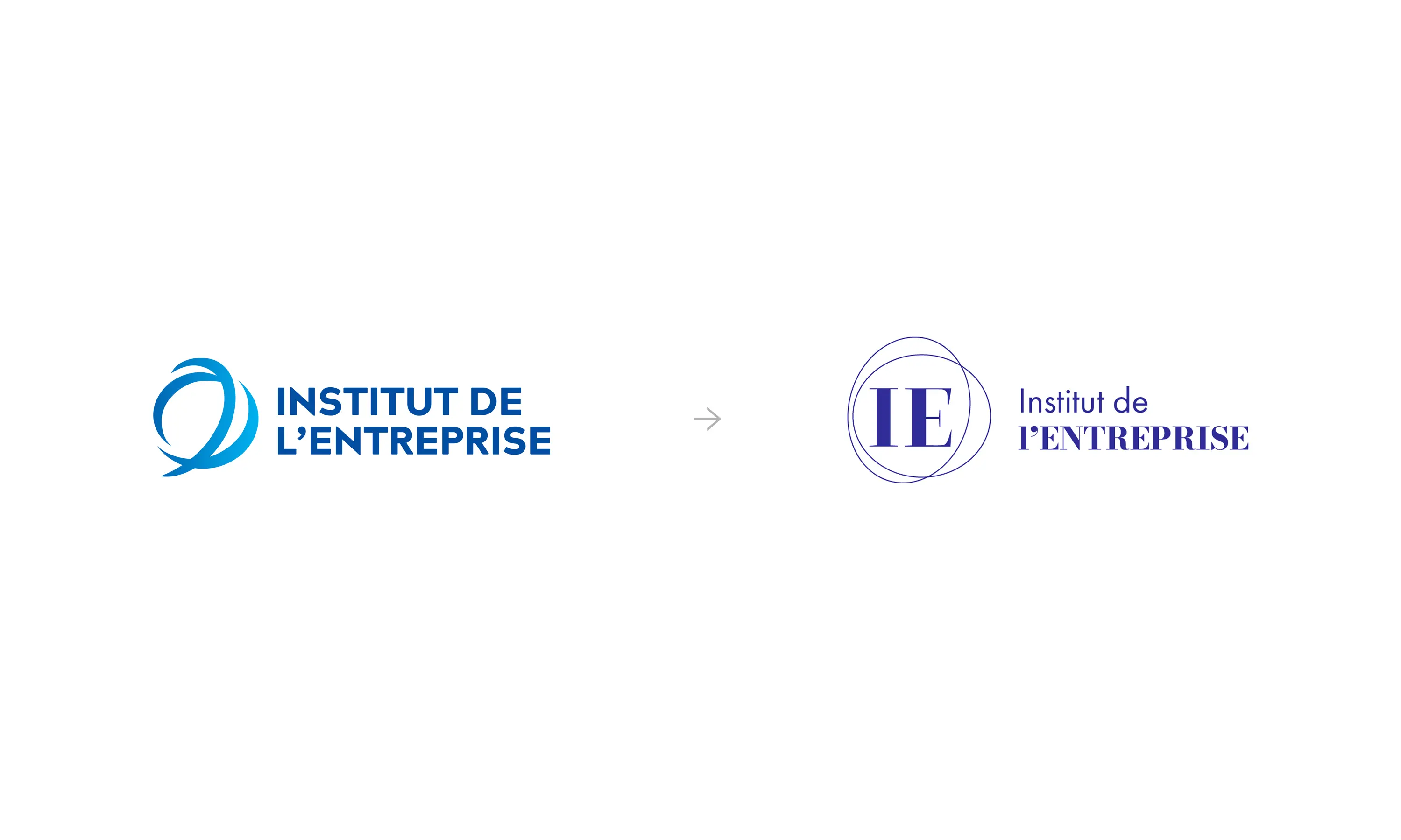
The problem faced by the NPO was its architecture: each "sub-brand” had its own identity with no link to the "umbrella brand" (L'Institut de l'Entreprise). This is why, once again with the agency KAZE, we proposed an overhaul of the brand base where “L'Institut de l'Entreprise” is present in each program.
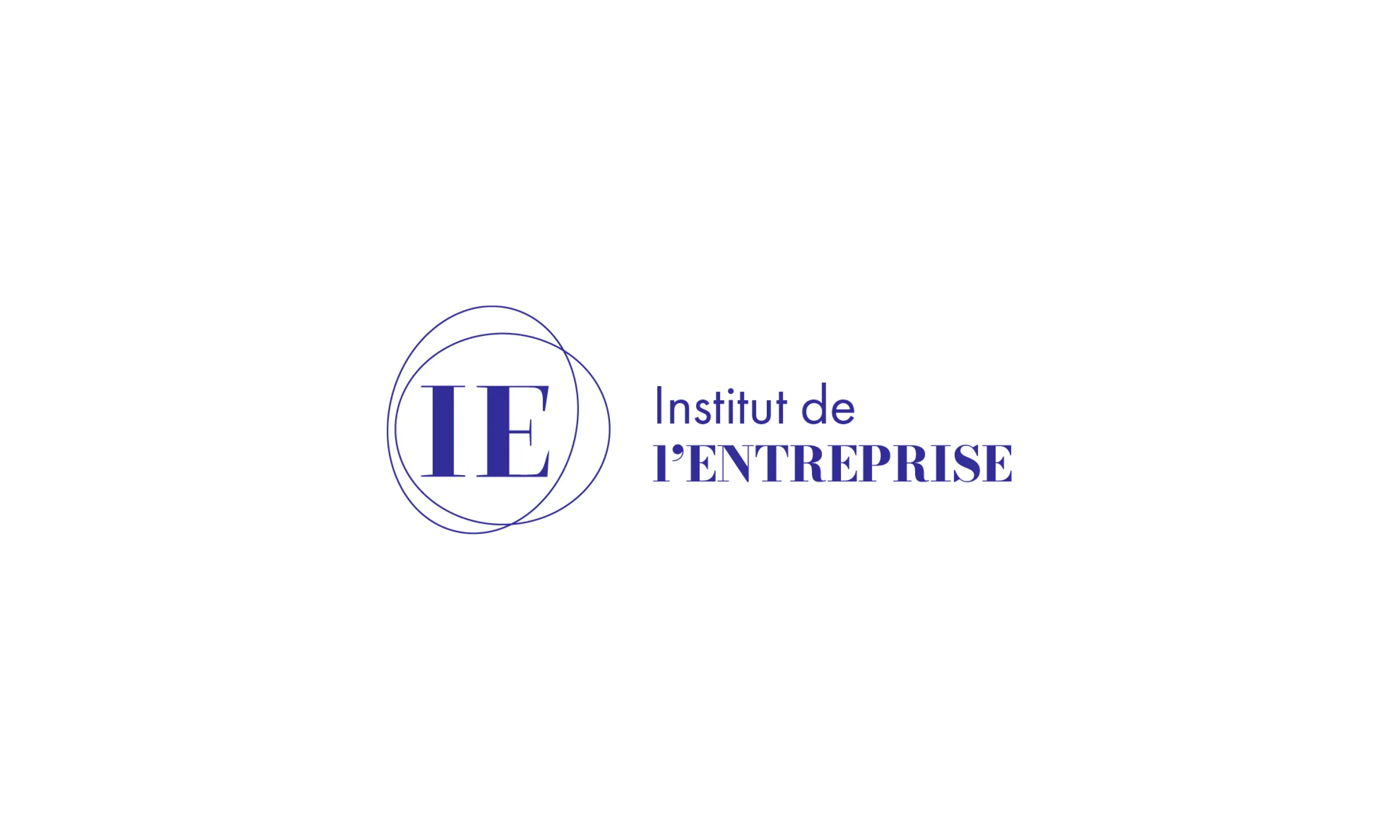
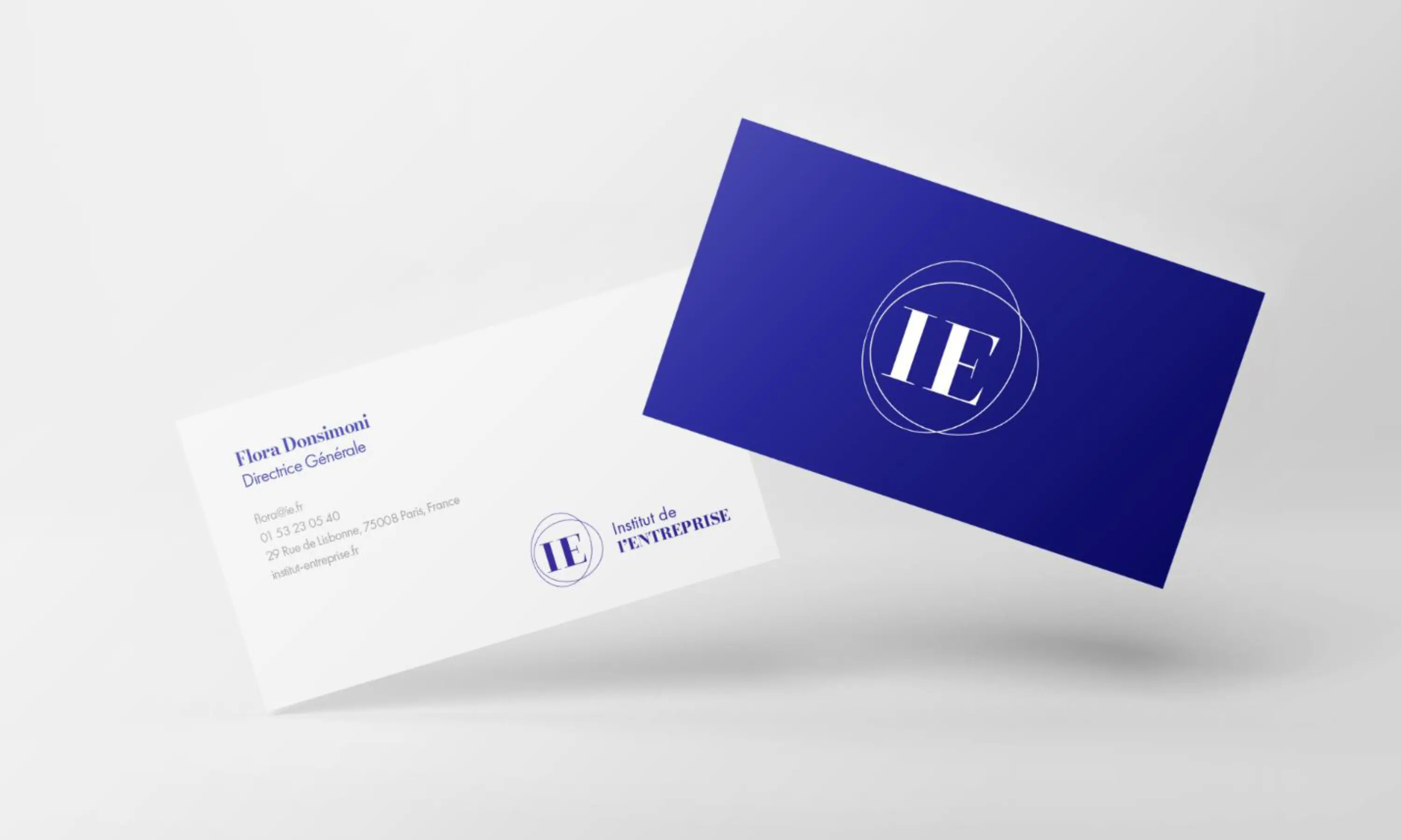
Our creative solution was to transform the arabesques of the old logo into two stars-circles containing the initials of the NPO. The typefaces chosen were Bodoni Moda and Sofia Pro sans-serif, a mix of elegance and modernity. We were able to revise the brand tree structure, keeping the association logo with each daughter brand where the program name was positioned on a second level. Each color was reviewed: the blue evolved into a “Klein blue”, while the logos of the daughter brands were made brighter.
The new brand chart was then applied by a developer on L'Institut de l'Entreprise website.
Year
May 2024
Lire en Français 🇫🇷