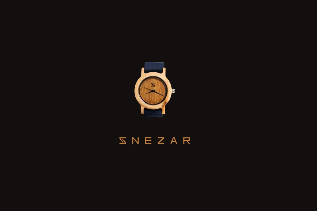

Snezar
Brand identity design for a South African brand specialising in bamboo watches.
YEAR
Services
How to rebrand a South African product for South Africans without using an African continent symbol?
SNEZAR is a South African bamboo watch brand, created by Sinekhaya Manciya. Later joined by Tsepo Ngwenyama, they decided together to evolve the brand’s visual identity, which originally consisted of the word ‘SNEZAR’ (SNE for Sinekhaya’s initials and ZAR for the South African currency) combined with a map of the African continent. Describing themselves as ‘just two South Africans passionate about building something on their own,’ Sine and Tsepo target young people from underprivileged backgrounds and working-class communities in South Africa. They also focus on young entrepreneurs who know it’s possible to dress well and stylishly at affordable prices.

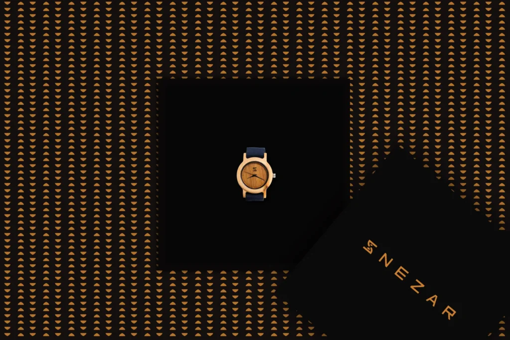
Own your time, Own your future!
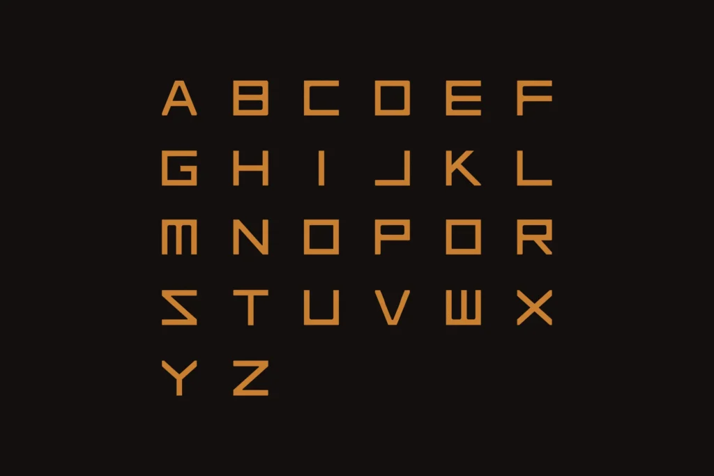
First, my graphic response began with research on their slogan, ‘Own your time, Own your future!’ I decided to create a logomark using the first letter of the brand, with an hourglass — a symbol of time — carved inside the ‘S’. Regarding the typography, I designed a custom typeface in all uppercase, intended only for headings. The letterforms are geometric, each based on the same structure with equal width and height, and slightly rounded corners. For the color palette, the clients emphasized the concept of a brand ‘by South Africans, for South Africans.’ They chose black for its sobriety, and I added contrast with a light ebony-gold tone to enhance a chic and elegant feel.